- Very Peri is the colour of hope
- Four complementary colour schemes to go along it
- Applying them in your living space
Colours! There are so many of them, and at times, we just don’t know what to choose. This is especially true when it comes to interior design, where the colour of the sofa needs to match with the throw pillows and the wall paints, yada, yada, yada. Do you find that confusing? Oh, try this instead. Every year is defined by a different colour.
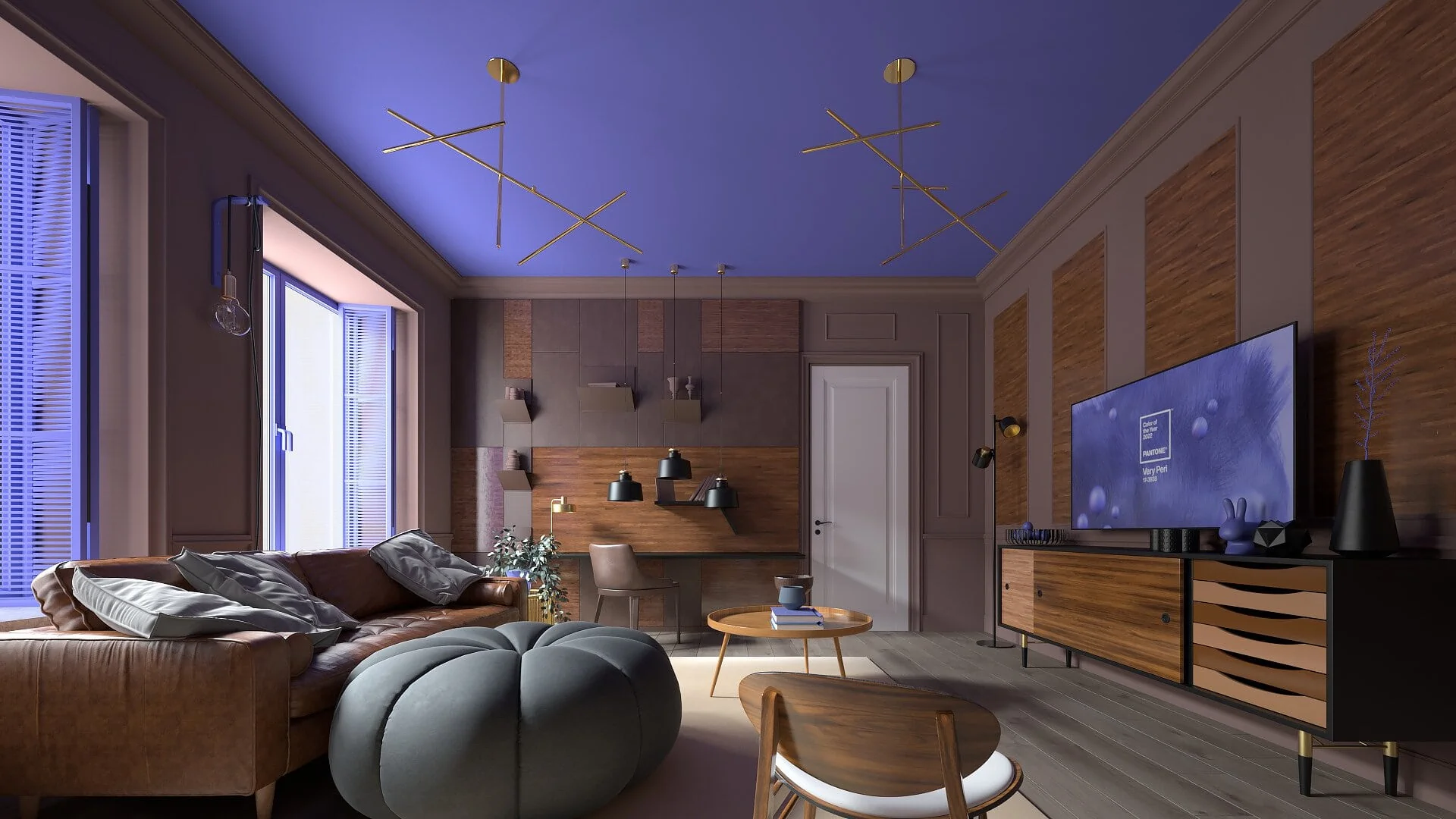
Interior design enthusiasts religiously deck their homes with the colours of the year, and it can be quite a hassle to follow the trend. Fortunately, the colour for the year 2022 is Very Peri, and I have to say that it is a very lovely colour. No complaints here.
What is Very Peri?
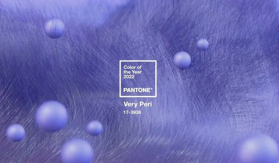
Also known as Pantone 17-3938, the colour encourages personal inventiveness and creativity. Source: looka
For those who love blue and purple, this is your lucky day…or year, because it is vogue! Then again, who determines what is vogue and what is not? Well, every year, worldwide colour authority Pantone picks the colour that will be making headlines in the coming season.
Very Peri, a vibrant periwinkle blue colour with a rich violet-red undertone, has been crowned Colour of the Year 2022. But why? According to Pantone, Very Peri is a reminder to embrace the altered landscape and trust in the future possibilities. Is it just me, or does it sound like the ongoing Covid-19 pandemic influenced the colour choice? Do share with us your thoughts!
I’m going with Very Peri. Bring out the paint now!
Sold on the colour already? Great. But just because you love purple and blue does not mean that you are going to turn the entire home into a Petunia. Balance is required. For example, if you are going for a black and white colour scheme, then a black sofa will make for a wonderful companion to the white wall.
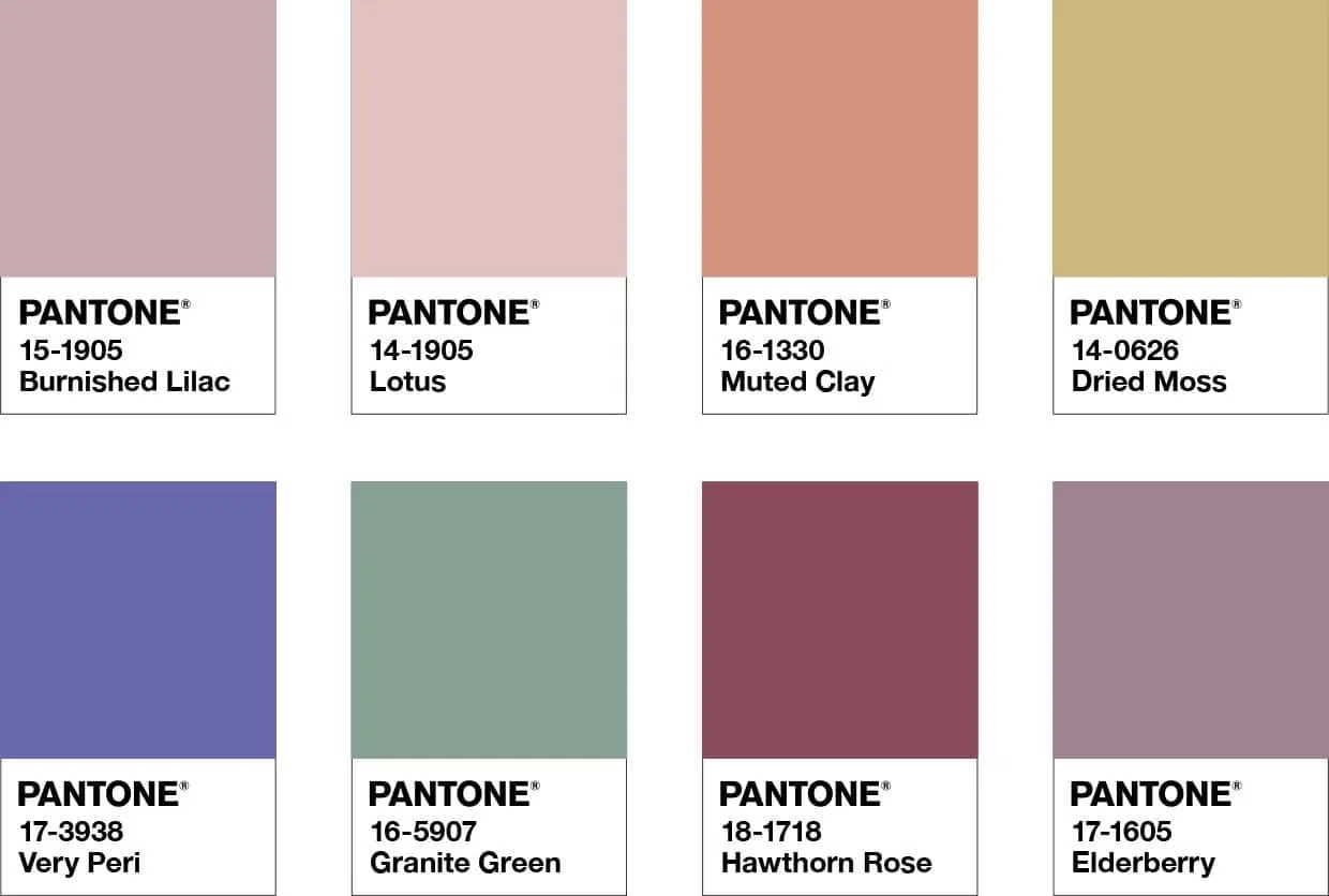
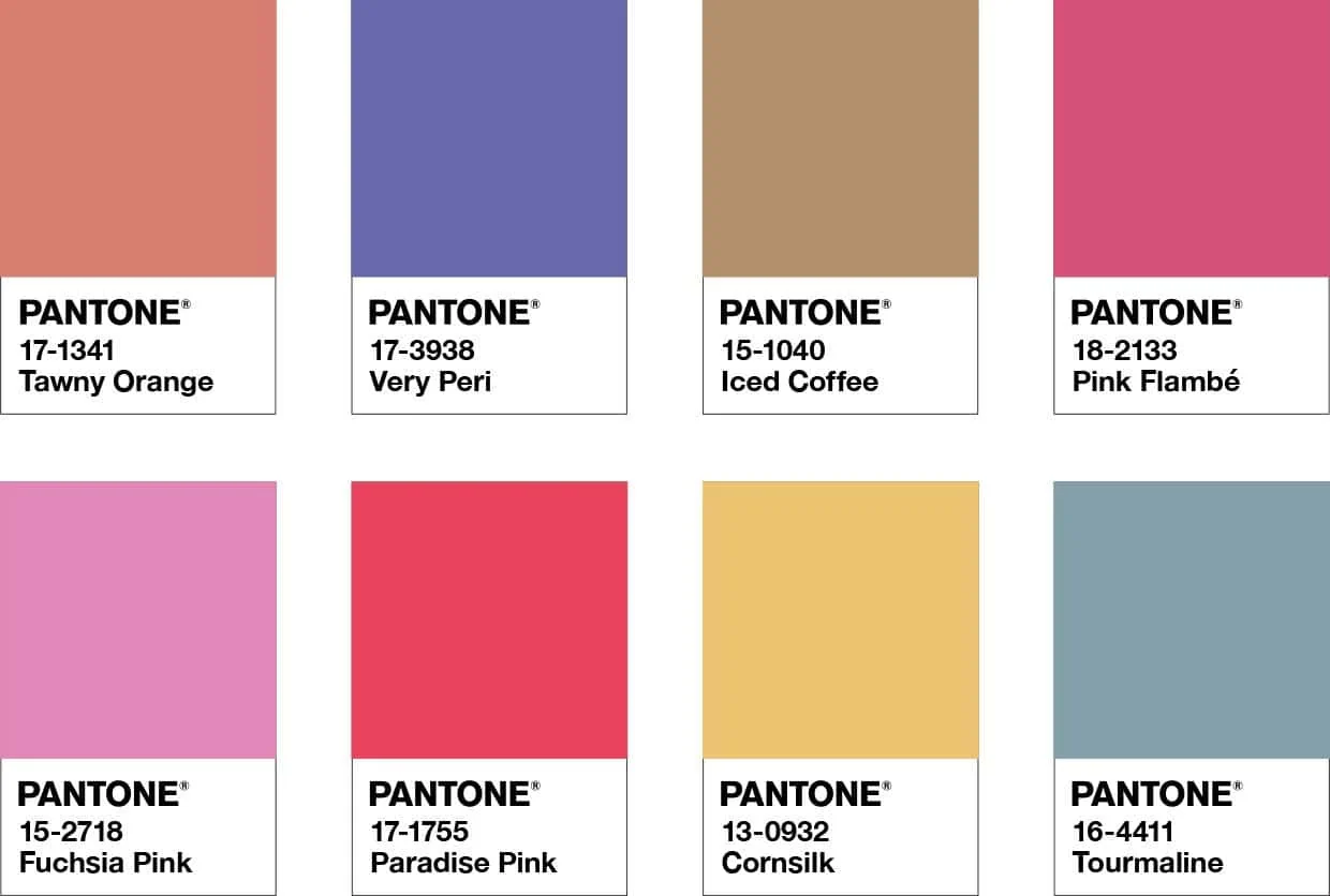
White bed sheets go well with a black bed and black tables to white plates. You get the idea. Now, how about Very Peri? Well, Pantone is a saviour itself. They didn’t just produce one, but four sets of colour compliments to match with Very Peri. Each represents different moods, and they also come with an easy-to-follow colour harmony bar for your consultation. Check them out below:
A complementary palette of colour whose natural balance of warm and cool tones support and enhance one other. Source: Pantone
Harmonise them with this combination:
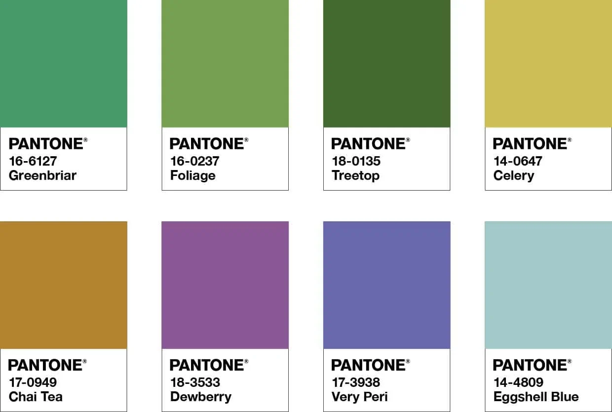
Wellspring
A holistic and harmonious blend of nature-infused shades, Wellspring highlights the compatibility of the greens with good-natured Very Peri. Source: Pantone
Harmonise them with this combination:
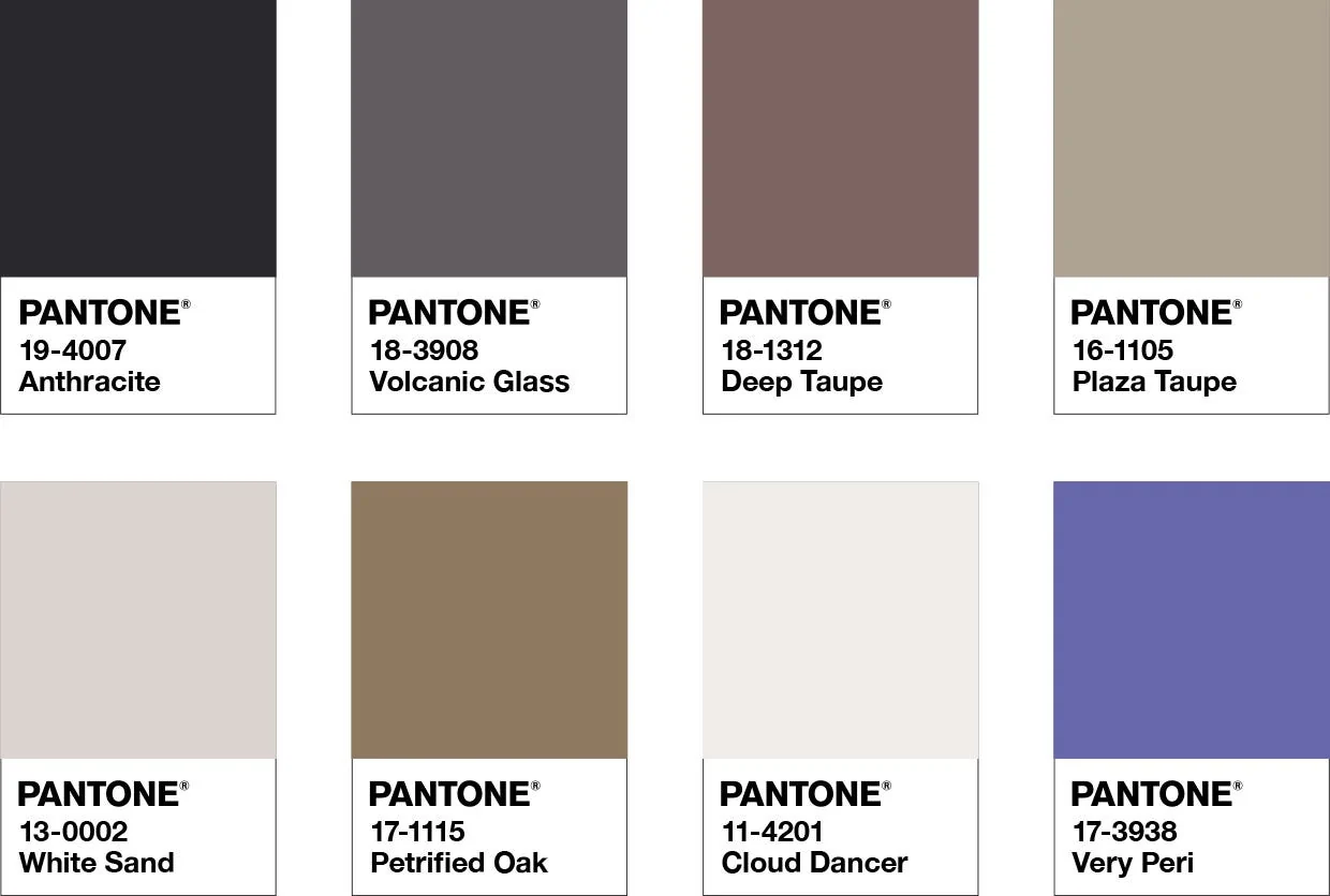
The Star of The Show
Surround this happiest and warmest of all the blue hues with a palette of classics and neutrals whose essence conveys a message of timeless sophistication. Source: Pantone
Harmonise them with this combination:
Amusement
Vivid splashes of pink, red and yellow bring about a joyous atmosphere, further amplified by the carefree confidence of Very Peri. Source: Pantone
Harmonise them with this combination:
Time to get inspired
Things might get a little convoluted with the kaleidoscope of colours, so we have decided to attach several guides on how to decorate your living space. The nssgclub and hommes.studio have written a very comprehensive discussion on Very Peri and how to incorporate it into your design.
There is also Pinterest if you want to find more inspiration. So, do check them out! Also, below are several samples of living spaces that adhere to the colour scheme:
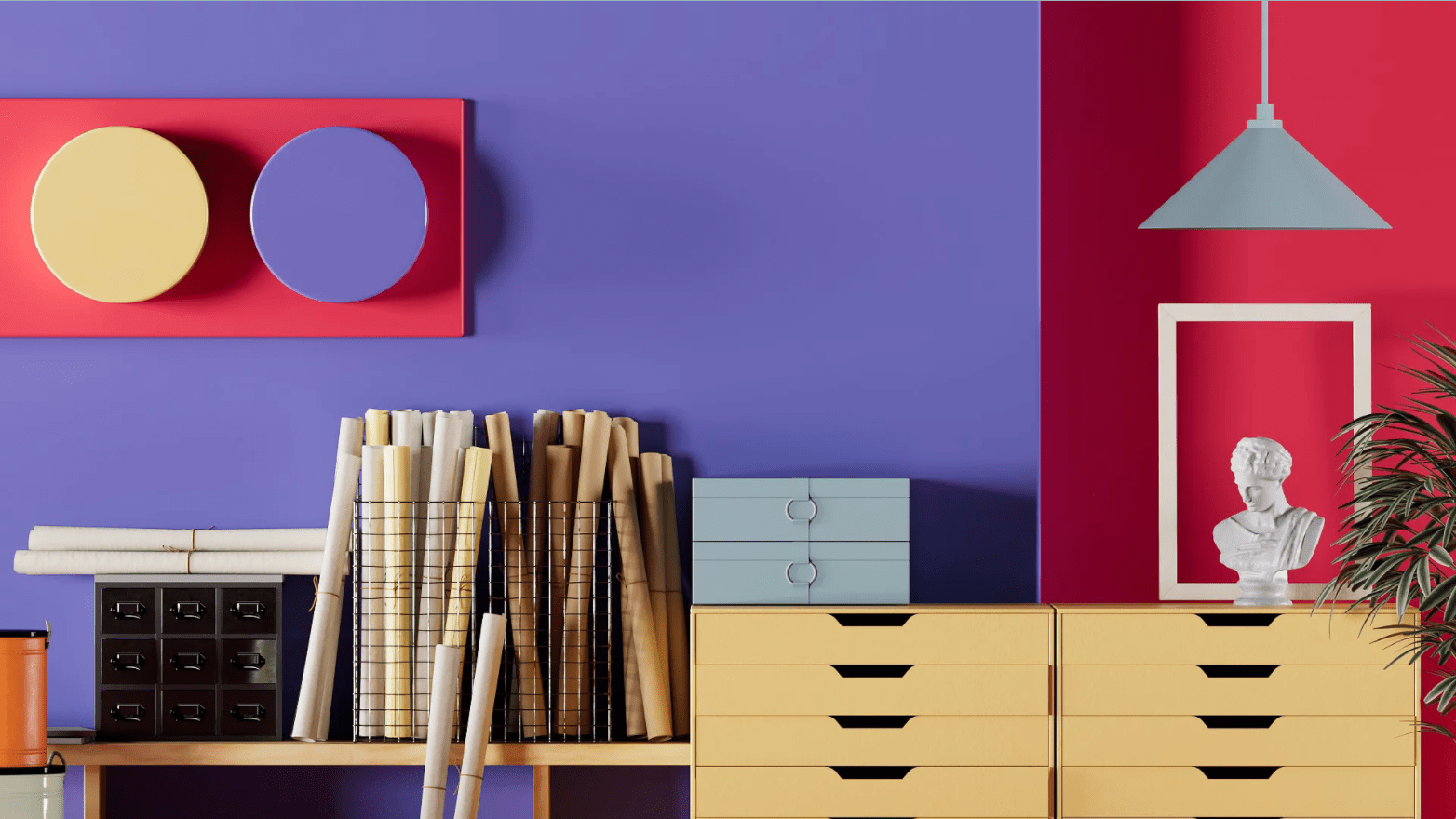
Red and yellow! And I never thought these two colours would go well with purple. But thanks to the versatility of Very Peri, the combo gives rise to an energetic yet reserved atmosphere.
Oh, the joy of cooking in such a chic kitchen! The purple-blue undertone is so uplifting while the surrounding neutrals create an immaculate feel that is both clean and spacious. I can cook all day here.
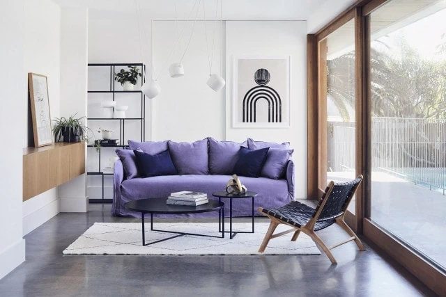
You can never go wrong when mixing neutrals, which express an aura of warmth and peace. Stepping into this house, I would notice the Very Peri sofa right away, which is appropriate since the colour combo was called The Star Of The Show! While you are at it, I am taking a seat.
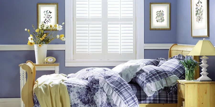
The purple from the wall, bedsheets and blankets bring a cool touch to the bedroom, facilitating slumber. This is balanced out by the vibrancy of yellow from the wood and flowers. Chef kiss! It is a treat to sleep and awaken in such a room!
Getting to work
Decor-whelmed by the variety of colour schemes? Don’t worry your head out. Take it slow and follow your heart. You will never go wrong. And while you are out shopping for the necessary paint or furniture to make this colour scheme work, think about the Very Peri and all that it symbolises.
Hope blooms at a time of crisis. It is a desire to see the end of pain and suffering. Hope is needed more than ever with the Covid-19 pandemic spreading unchecked outside our doors. And the Very Peri is here to remind us that hope is still alive.
